The DHS began testing its redesigned E-Verify interface, which includes new navigation tools, case alert functionality, and other features designed to increase employer compliance while maintaining employee privacy. The new E-Verify look is part of a broader DHS initiative to improve operating efficiency and user friendliness in response to previous evaluations which found the system to be burdensome and lacking in safeguards. While employers will most likely welcome the new look and functionality, these cosmetic changes won’t address the program’s effectiveness or accuracy rate, which came under fire last week. DHS seems committed, however, to continually improve the system on both fronts, so let’s take a sneak peak at some of the pros and cons of this redesigned interface.
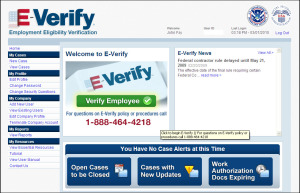
 The Home Page has been redesigned to provide a quick link to start a new verification and also inform users of E-Verify news and case alerts. At present, the news appears to be more along the lines of system alerts, which in the past, have not been updated that frequently. The navigation pane on the left-hand side has also been modified, although the overall functionality is the same.
E-Verify Case Alerts are located at the bottom of the screen, and are intended to bring to your attention cases that need some action. In particular, users can see Open Cases to be Closed; Cases with New Updates; and Work Authorization Documents Expiring. This last alert, while helpful on the surface, may actually cause confusion since employers are supposed to reverify employment authorization on the I-9 form in these situations, and not through E-Verify.
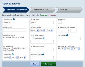
 Verification: the screen for entering I-9 information now displays the fields in 3 columns (rather than 1 long one) and features pull-down menus for the various date fields (hire date, doc expiration date, etc.). The SSN field now has 3 boxes to force the user to enter the number in a proper format. After the verification has been completed, the system will mask the SSN, to preserve the employee’s privacy. Noticeably absent, however, is real-time field alerts when the user has entered an improper document number or hire date.
Navigation and instructions As you’re performing an E-Verify query, the system highlights a progress indicator (>>) to visually represent where you are in the verification process. E-Verify Instructions and terms have also been simplified (e.g., “resolve case” will now be called “close case”).
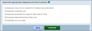
 Close case process has also been reworked so the employer now has choices written in plain language. (Say good bye to “Invalid Query!”). The first question asked is whether the employee is currently employed with the company. If yes, the user can choose to indicate that they entered data more than once, submitted incorrect data, or the employee chose not to contest a TNC (if applicable). If the employee is not currently employed, the employer can indicate whether the employee quit or was terminated for some other reason.
It’s not yet clear when E-Verify will release this new look on their live servers, but given the recent pressure and scrutiny, I expect to see it very soon.